
Why Packaging Artwork Fails at the Pre-Press Stage
Most delays on a first production run are not caused by the printing press. They are caused by packaging artwork that was never prepared for the print process in the first place. A file that looks perfect on a screen can still be missing bleed, using the wrong colour space, or hiding text too close to a fold line. This checklist covers the mistakes that come up most often and how to avoid them before the artwork reaches the converter.
Start With the Right Structure, Not Just the Artwork
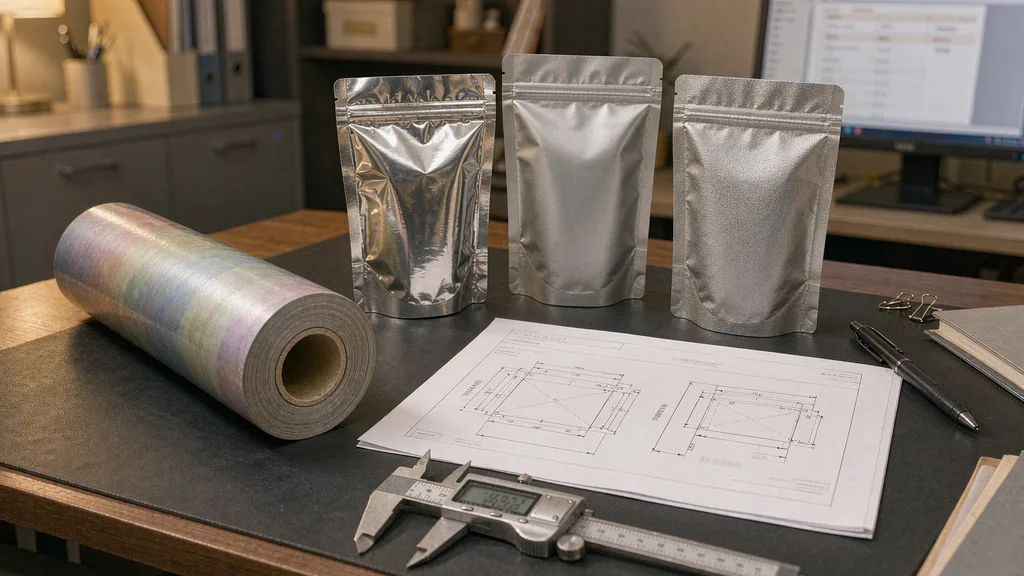
Before a single layer is drawn, settle the pouch format and the dieline. A stand-up pouch, a flat bottom pouch and a four-side seal pouch each have a different die line, and the safe print area changes accordingly. Preparing packaging artwork against a placeholder rectangle rather than a real dieline is one of the most common causes of rework. Our guide to four-side seal pouch structure, print and cost explains how the format drives the layout.
The Ten-Point Pre-Press Checklist
- Use the converter’s real dieline, not a guessed template.
- Set the document to CMYK, not RGB, to avoid colour shifts.
- Keep a 2 to 3 mm bleed beyond the trim line on every edge.
- Hold all text and logos at least 3 mm inside the seal and fold zones.
- Convert all fonts to outlines, or embed them fully.
- Embed images at 300 dpi at final print size.
- Set rich blacks deliberately, and avoid four-colour small text.
- Name spot colours clearly and mark any varnish or matte areas on a separate layer.
- Flatten transparency and remove unused layers before export.
- Export a press-ready PDF plus a low-resolution proof for internal sign-off.
Why Colour Management Catches People Out
Flexible films are printed on substrates that behave differently from paper, and the same colour value can land differently across a matte or glossy finish. Supply the converter with a colour reference, ideally a physical swatch, rather than relying on the on-screen appearance. For coffee and other premium products where colour consistency carries the brand, the visual decisions are worth locking early, as we outline in our coffee packaging design guide.
Barcodes, Legal Text and Variable Data
Barcodes need a quiet zone and a minimum size to scan reliably, and they cannot sit over a seal or a curvature. Legal text such as net weight, ingredients and storage instructions must be legible at the final size and cannot be squeezed into a decorative font. Sort these elements out before the design is frozen, because changing them later usually means re-proofing the whole layout.
Build a Proof Cycle Before You Print
A digital proof confirms layout and colour intent but cannot show how ink behaves on film. A physical proof or a short press sample is what catches registration, seal registration and finish problems. Budget one proof cycle into the schedule rather than treating it as an optional extra, and sign off against a written checklist so the decision is documented.
Handing Over Clean Files
A clean handover includes the press-ready PDF, the layered source file, the linked images, the dieline and a written note of any spot colours or finishes. This package saves back-and-forth emails and makes a repeat order far faster, because the next run starts from a known good file rather than a rebuilt one.
Need a second pair of eyes on your packaging artwork before it goes to press? Contact our team for a pre-press review, or see the full range of pouch formats at www.purestpack.com.